The mistake I correct most often in family homes, and the two-plus-one rule I use to fix it
Too many wood tones is the most common fault I find in rooms that are, on paper, doing everything right. The client has bought natural materials. They have kept the palette neutral. They have resisted colour, resisted clutter, resisted the urge to buy a statement anything. And the room still feels slightly restless in a way they cannot name, so they assume something is missing and start shopping again. Nothing is missing. There are five different woods in there, all of them lovely, and they are cancelling each other out.
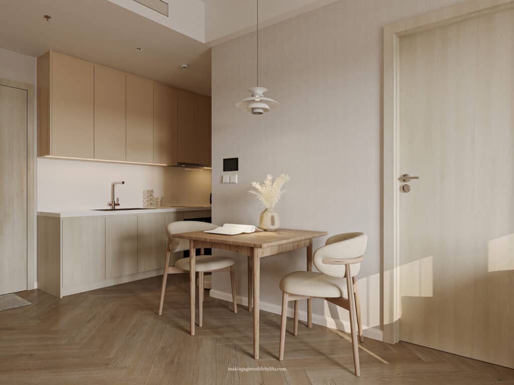
This is a particularly Japandi problem, and I think it is worth saying why. In a maximalist or eclectic interior, a mixture of timbers reads as collected, because everything else in the room is also varied and the eye has no expectation of consistency. Japandi sets a much stricter contract with the person standing in the room: very few materials, repeated with discipline, so that texture and grain do the work colour would normally do. Break that contract, and the room does not read as eclectic, it reads as unresolved. The same six pieces of furniture in a busier scheme would look perfectly fine.
- What Types of Wood Are Used in Japandi
- 10 Ways to Use Wood Slat Panelling in Japandi Bathroom
- 5 Japandi Wood Flooring Patterns That Redefine Elegance and Style
What makes it hard to spot is that no single item is the problem. You cannot walk in and point at the offending object, because there isn’t one. Every piece is defensible on its own, which is exactly why the fault survives so long: clients look at each element, decide it is fine, and conclude the issue must be something else. So here is how I actually diagnose it, and the rule I use when rebuilding a scheme from scratch.
What goes wrong when a room has too many wood tones
The first casualty is depth. In a well-made Japandi room, a darker timber against a lighter one creates a quiet hierarchy: your eye understands which surfaces are the background and which are the substantial pieces. Add a third and a fourth tone and that hierarchy collapses, because there is no longer a clear light and a clear dark, just a spread of middles. The room flattens. Clients describe this as the space feeling “busy but empty”, which is a very accurate description of what is happening.
The second casualty is the sense that anything was chosen. A room with two woods reads as a decision. A room with five reads as an accumulation, and the eye is remarkably good at telling the difference even when the owner cannot articulate it. This is the thing that separates a scheme that looks designed from one that looks assembled over time, and it has almost nothing to do with how much each piece cost. I have seen very expensive rooms fail this test and very modest ones pass it.
The third, and the one people notice last, is that clashing undertones make everything look slightly dirty. Put a yellow-toned pine shelf near a pink-toned beech table, and both woods lose their quality. The pine looks orange, the beech looks washed out, and the client concludes they need to repaint the walls. They do not. The wall was never the problem.
Undertone matters far more than how dark the wood is
Most advice on mixing wood tones talks about light and dark, and it is looking at the wrong property. Two woods of completely different darkness will sit together beautifully if their undertones agree. Two woods of almost identical darkness will fight if they do not.
Undertone is the colour bias sitting underneath the brown, and it falls into three broad camps. There are yellow and golden woods, which include most pine, some oak, and a great deal of inexpensive flat-pack veneer. There are red and orange woods: cherry, mahogany, plenty of older teak, and the honey-varnished floors that came with half the housing stock in the UK and the Netherlands. And there are cool or neutral woods, with a grey, taupe or faintly pink cast: white oak, ash, birch, most Scandinavian furniture, and the smoked and limed finishes that dominate current Japandi product.
The single most useful thing you can do this week is work out which camp each timber in your room belongs to, and the way to find out is not to stare at it. Photograph each piece separately, in daylight, then put the photographs side by side on your phone. Isolated from context, the undertones become obvious in about ten seconds, and clients are routinely startled by what they see. The oak they thought was neutral is distinctly golden. The “walnut” sideboard is red. This is also the reason a piece that looked perfect in a showroom looks wrong at home: the showroom lighting was neutral, and your north-facing living room is not. I have written more about the timbers themselves in my guide to what types of wood are used in Japandi.
Mixing across camps is not forbidden. It just has to be deliberate, and it has to be rare.
The two-plus-one rule I use for mixing wood tones
Here is the working rule, and I apply it in almost every room I design.
One dominant wood. This is your largest area of timber, and in most homes it is the floor, whether you chose it or inherited it. It sets the undertone family for the whole room, and everything else is judged against it rather than against an idea in your head.
One companion wood. Distinctly different in darkness from the dominant, same or closely related undertone. This is the wood that does most of your furniture: the dining table, the sideboard, the bed frame, the shelving. The contrast in value is what gives the room depth, and keeping the undertone aligned is what stops that contrast turning into conflict.
One accent, and only one. A single piece in a genuinely different timber, ideally with some presence: a walnut stool against pale oak, a black-stained slatted panel, a stump side table in something with real grain. This is the piece that stops the room looking like a catalogue set. It works precisely because it is alone, and it stops working the moment there are two of it.
That is three woods, which sounds generous until you start counting. Doors count. Window frames count. Skirtings count if they are timber-finished. Picture frames count when there are six of them. A wooden toy kitchen absolutely counts, and in family homes it is very often the uncounted fourth tone that pushes a room over. Count everything at eye level and below, and count the floor twice, because it is doing more work than anything else in the room.
The accent is also where a strong dark note can earn its place, and the logic sits alongside what I set out in my post on adding contrast without breaking the calm: one dark element repeated reads as structure, several competing dark elements read as noise.
When you cannot change the floor, the doors, or the furniture you already own
Most of the rooms I am sent come with at least one wood tone that is not up for discussion, and usually it is the worst one. Orange-varnished pine floors, mid-2000s beech doors, a solid oak table that belonged to someone’s grandmother and is not going anywhere. This is normal and it is workable.
The first move is to accept the fixed element as your dominant tone rather than fighting it. A room with a golden floor is a warm room, and it will look far better with warm-leaning companions than with the cool grey oak the client had pinned. Trying to force a cool scheme over a warm floor produces exactly the muddy effect described above, and it is the most expensive mistake in this whole category, because people buy an entire suite of furniture that never settles.
The second move is to reduce the count elsewhere so the awkward tone has room to sit. If the floor is a difficult colour, take the timber out of the smaller items entirely: metal or ceramic lamp bases, painted picture frames, a stone or linen-topped side table. Fewer woods in total make a difficult floor read as intentional rather than dated.
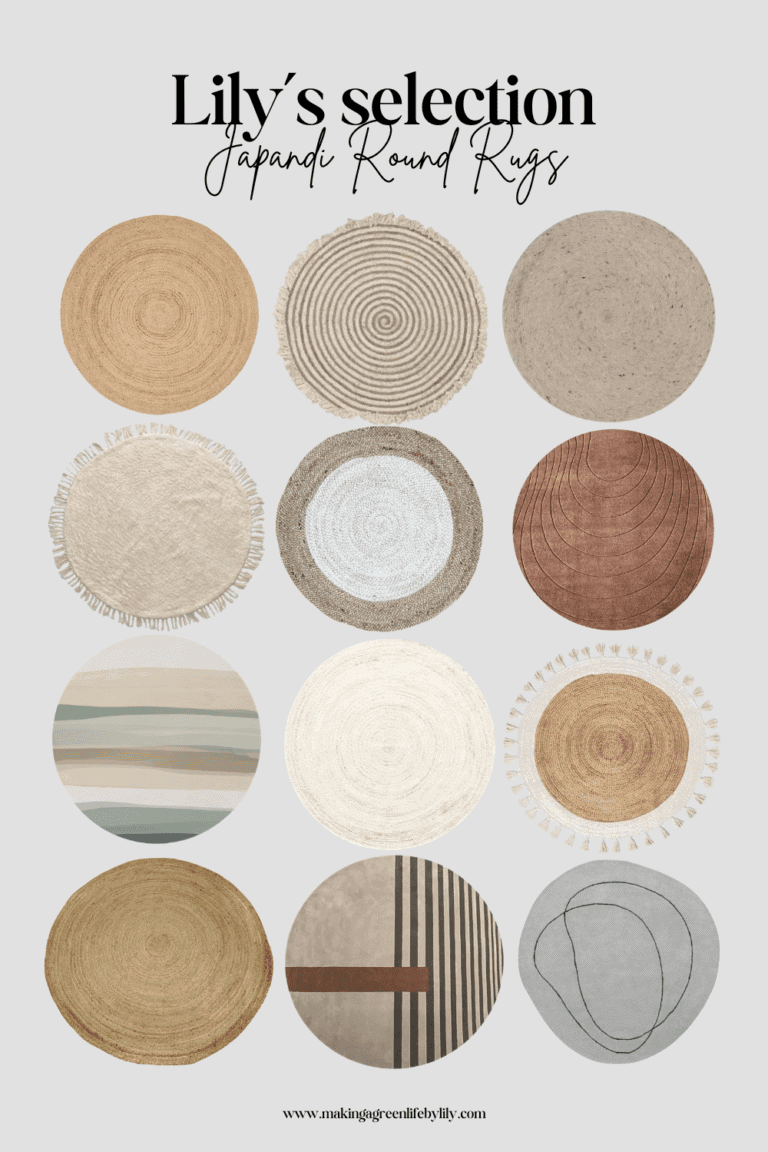
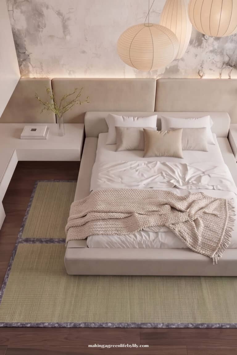
The third is to interrupt it. A large natural-fibre rug, a tatami rug, a jute or wool flatweave, covers a substantial proportion of a floor you dislike and replaces it with a texture that agrees with everything. This is quietly the cheapest fix in the entire article, and it is the one I recommend most often to renters, who have no other option. Wall texture does similar work vertically: slatted panelling in your chosen companion tone gives the eye a large, calm area of the wood you actually want, which shifts the balance of the room without touching the floor at all. I have set out eleven ways to do that in my post on wood slat panelling in a Japandi home.
The five-minute test
Stand in the doorway and count the distinct wood tones you can see, out loud, including the floor and the doors. If you reach four, one of them is doing nothing that another could not do better, and it is almost always the smallest item rather than the piece you are most attached to. Remove it for a week. Rooms are honest after a week in a way they never are in the first hour.
Then take one photograph of the room in the afternoon and convert it to black and white on your phone. Colour is a distraction here; what you want to see is whether there is a clear lightest area, a clear darkest area, and a legible spread between them. If the greyscale image is one continuous mid-tone, your room has no depth, and adding a genuinely dark accent will do more for it than anything you could buy in a lighter shade.
Final thoughts on Why Too Many Wood Tones Quietly Destroy Japandi Balance
Wood tones are the quietest thing in a Japandi room and the most decisive. Get to two woods with agreeing undertones, add one accent with real conviction, and a room that felt restless for years will settle in an afternoon, usually by removing things rather than buying them. That is the part clients find hardest to believe and the part that works most reliably.
If you have counted four or five and cannot see which one to lose, that is a very good use of an hour of a designer’s time. My e-design service covers exactly this kind of decision, and I work remotely with families across the UK, the US and the Netherlands, usually from photographs much less flattering than the ones you are worried about sending.
Related Japandi Articles:
- What Types of Wood Are Used in Japandi
- 11 Creative Ways to Use Wood Slat Panelling in Your Japandi Home
- How to Add Contrast Without Breaking the Calm
- 5 Japandi Wood Flooring Patterns That Redefine Elegance and Style
- Japandi Materials
- The Art of Layering Textures in Japandi Design
- 10 Core Principles I Follow When Designing Japandi Spaces As an Interior Designer
- Avoid These 7 Mistakes When Trying Japandi Style
- Japandi Earth Tone Colour
- What a Japandi Rug Actually Does for a Room: My Case for Tatami
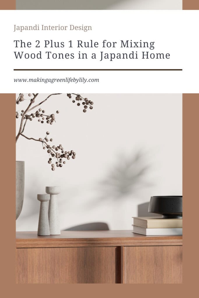
Why Too Many Wood Tones Quietly Destroy Japandi Balance