Last Updated on 31 July 2026 by makingagreenlifebylily
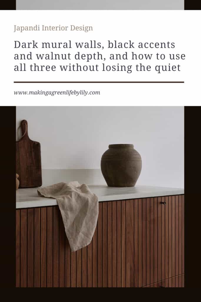
Dark mural walls, black accents and walnut depth, and how to use all three without losing the quiet
Japandi contrast is the thing clients ask me for without quite having the words for it. They send me their moodboard, all sand and pale oak and soft white linen, and then they write underneath it something like “but I don’t want it to feel flat” or “it looks a bit like a showroom, doesn’t it”. They are right. A room built entirely from light neutrals and pale woods can read as calm in a photograph and as strangely unfinished in real life, particularly on a grey February afternoon in the UK or the Netherlands when there isn’t enough daylight to give those pale surfaces anything to do. What they are missing is depth, and depth comes from contrast.
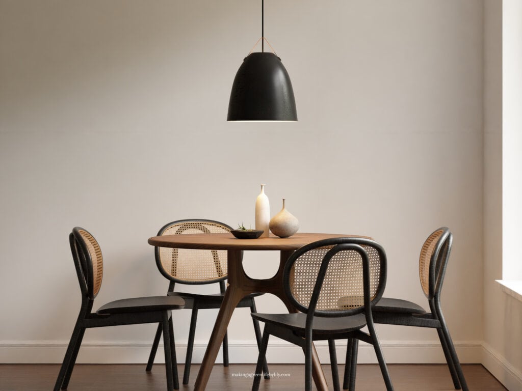
The problem is that most advice on adding contrast to a minimal interior comes from a maximalist instinct. Paint a feature wall electric blue. Add a bold rug. Bring in a statement chair. All of that works in a differently styled home, and all of it will wreck a Japandi room, because the calm you have been carefully building is not made of colour restraint alone. It is made of a very small number of tones doing very consistent work across a whole space. Break that consistency, and you don’t get contrast; you get noise.
- 5 Ways of Using Contrast to Enhance Your Japandi Style Home
- What is Japandi Style? How to Incorporate Japandi Design in Each Room?
- What is Japandi Materials?
So this is the version I actually use with clients: a dark mural wall, black accents, and walnut. Each one adds weight to a room without changing its temperature, and each one has a rule attached that I would not break, because I have seen what happens when it is.
Why japandi contrast usually goes wrong
Almost every contrast mistake I am asked to fix comes down to the same thing: the darkness was added as an object rather than as a surface. Someone buys a black armchair, or a charcoal rug, or a dark sideboard, and drops it into an otherwise pale room. The eye goes straight to it and stays there. The room now has a focal point it never asked for, and everything else quietly reorganises itself around that one heavy thing. The calm is gone, not because the object is ugly, but because it is the only dark thing in the room and it is sitting in the middle of the floor.
The second mistake is variety: black picture frames, a charcoal throw, a walnut stool, a bronze lamp and a deep green cushion, all in the same eight square metres, all added in the name of depth. Each choice is defensible on its own. Together they read as clutter, because the eye cannot tell what the dark tone of the room actually is. You want one dark note, repeated. Not five, competing. This is the correction I make most often, and it usually involves removing things rather than buying anything.
The third is placing darkness where the light already is. A dark surface on the wall that catches your best afternoon light will absorb it, and you will feel the loss. Contrast belongs where a room is already quiet: the wall behind you as you enter, the recess that never gets direct sun, the corner that reads as dead space. It is the same logic I set out in my 10 core principles for designing Japandi spaces, where light is treated as a material rather than a condition you are stuck with.
The dark mural wall: depth as a surface, not an object
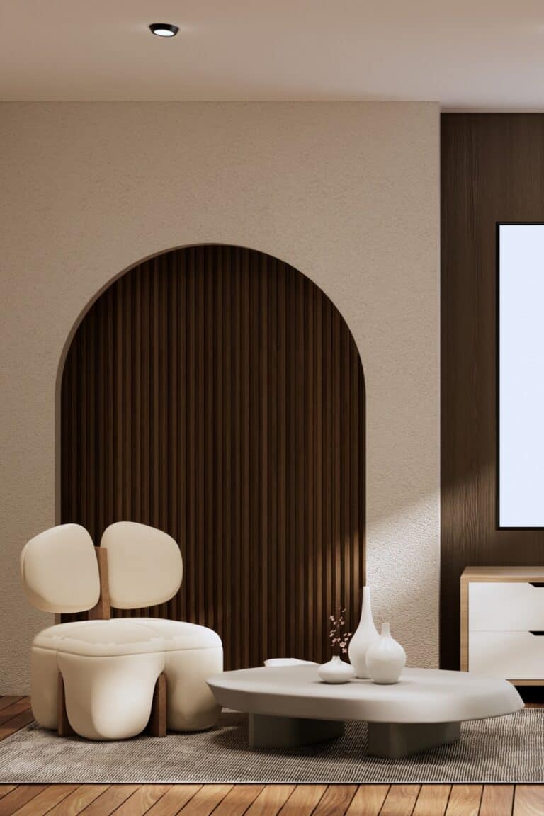
A dark mural wall is my preferred way to add contrast because it solves the object problem completely. The darkness becomes architecture. Because it covers a whole plane rather than a single item, your eye reads it as the back of the space instead of as a thing to look at, and that distinction matters more than any colour choice you will make.
What I look for in a mural for a Japandi room is a design with almost no incident: an ink-wash mountain fading into mist, a soft gradient from charcoal into warm grey, the suggestion of a landscape rather than a picture of one. If you can describe the mural in one short phrase, it is probably right. If it needs a sentence, it will fight the room. Colour-wise, I stay in warm darks, charcoal with a brown or clay undertone, rather than blue-blacks, which look sharp on a screen and read cold on a wall in northern European light. It is why I design the mural wallpapers in my own shop the way I do, warm-toned and very quiet, because that is what I kept needing for client rooms and could rarely find.
Placement is where most people go wrong. The right wall is the one you see when you are sitting still, not the one you see when you walk in. In a bedroom, that is the wall behind the headboard, which you rarely look at directly but which frames everything you see from the doorway. In a living room it is the wall behind the sofa, not the wall the sofa faces. Choose the quietest wall in the room and let the mural give that quiet some substance. For bedrooms, the rest of the layout logic sits in my guide on how to Japandi your bedroom.
One practical note, since most of my clients have young children: put the mural above the height where hands and scooters live, or choose a wipeable finish. A matt paper at skirting height in a hallway with a four-year-old in it is a decision you will regret by week three.
Black accents: small, repeated, and structural
Black is the most useful contrast tool in a Japandi home and the easiest to overdo. My rule is that black should be structural rather than decorative, and it should appear at least three times in a room or not at all. Structural means it is doing a job: a slim window frame, a tap, the thin metal legs of a dining chair, a matt door handle, the frame of a wall light. Decorative means it is there to be black, which is when a room starts to feel styled rather than lived in.
The repetition rule is the part people find counterintuitive. One black object in a pale room looks like a mistake. Three or four small black elements, spread across different heights and distances, read as a deliberate line running through the space, and your eye stops treating any single one of them as a focal point. I aim for something high, something at eye level and something low: a pendant flex, a handle, a chair leg. Together they take up perhaps two per cent of the visual field, and they are the difference between a scheme that looks soft and one that looks resolved.
Matt finishes only, and that is functional rather than stylistic. Gloss black reflects, and a reflection is a bright spot that pulls attention exactly the way a pale object would. Matt black absorbs, recedes, holds its line, and hides fingerprints considerably better. I would also keep true black away from soft furnishings: a black cushion or throw reads as a hole in a room, where charcoal or deep clay in the same position reads as depth.
Walnut depth: the contrast that reads as warmth
Walnut is the piece of this that most people underestimate. If you have built a room from pale oak, ash or birch, one walnut element does more for its depth than any amount of black, and it does it without cooling the space at all. Walnut is dark in the brown and chocolate register rather than the grey and black one, so it adds weight while raising the temperature of a room instead of lowering it. In a climate with long dim winters, that combination is hard to replicate any other way.
The rule here is one dominant wood and one accent wood, never three. Pick your primary timber, usually the lighter one, and let it do the floors, the built-in storage and most of the furniture. Then choose one walnut piece with real presence: a sideboard, a bed frame, a dining table, a run of open shelving. The contrast between those two woods is the depth. Add a third tone and you lose it, because the room stops reading as light-with-a-dark-note and starts reading as mismatched.
Walnut earns its place most reliably at the point where a room is used. A walnut dining table gets touched every day, and the way it darkens and softens over a decade is the whole argument for solid timber in a family home. Walnut takes wear and gets better looking for it, in a way that lighter woods under hardwearing lacquer generally do not. I made the practical version of this argument in my piece on what quiet luxury actually means in a family home.
Two things to watch. Walnut and charcoal work beautifully together, so the mural wall and the walnut piece can and probably should be in the same room: walnut against a warm charcoal wall holds its own, where pale oak looks washed out. And be honest about the grain. Heavily figured walnut is a pattern, and a pattern is visual activity. I want the straightest, calmest grain I can find, and will happily pay more for a quieter board.
How to tell whether you have broken the calm
The test I use takes ten seconds. Stand in the doorway, look in, and notice where your eye lands first, then where it goes second. If it lands on one dark element and stays there, you have added an object rather than a surface, and that thing needs to move, multiply or leave. If your eye travels and settles on nothing in particular, but the space feels grounded rather than floating, the contrast is doing its job.
The second test is time of day. A room with well-judged contrast looks different at eight in the morning and eight in the evening but feels the same in both. If your dark wall feels oppressive after dark, the issue is almost always lighting rather than the wall, and one warm lamp placed close to that surface will usually resolve it.
Final thoughts on How to Add Contrast Without Breaking the Calm in a Japandi Hom
Japandi contrast is not about being braver with colour. It is about being more disciplined with a very small number of dark notes, and letting them repeat until they read as structure rather than decoration. A mural wall gives you depth as a surface. Black gives you a line. Walnut gives you weight that is also warmth. Used together, with restraint, they turn a pale scheme that photographs beautifully into a home that actually holds you on a dark evening in January.
If your own space has that flat, unfinished quality and you are not sure which of the three would fix it, that is exactly the sort of question my e-design service is built for. I work remotely with families across the UK, the US and the Netherlands, and this tonal decision is often the one that changes a room most.
Related Japandi Articles:
- 10 Core Principles I Follow When Designing Japandi Spaces As an Interior Designer
- How to Japandi Your Bedroom
- What Quiet Luxury Actually Means in a Family Home
- 11 Creative Ways to Use Wood Slat Panelling in Your Japandi Home
- 7 Thoughtful Ways to Make Your Living Room Feel More Japandi
- 5 Elements of Japandi
- Avoid These 7 Mistakes When Trying Japandi Style
- How to Create a Family-Friendly Japandi Home
- 5 Ways to Optimise Storage in a Japandi Living Room
- Slow Living Starts at Home: The Lifestyle Behind Japandi Design
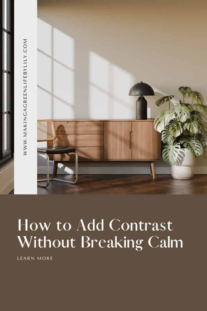
How to Add Contrast Without Breaking Calm